RAW
When I arrived in Cambridge for college in 2006, I started skating around town to get to know Boston better. I had a VHS tape of PJ Ladd’s Wonderful Horrible Life, and I thought that the shop behind that video, Coliseum, would be my go-to skate shop in town.
It turned out that Coliseum was way outside the city, and was no longer really the spot anyway. It wasn’t long before I discovered True East Skate Shop, located at 32 Province Street, a stone’s throw from Boston’s Downtown Crossing and a myriad of skate spots. True East quickly became a daily lurk.
It was here, at True East, that I met many of my longtime Boston friends, and it was also here that I began making skate graphics. Under conceptual guidance from my buddy (and store manager) Evan Collins I made many True East t-shirt designs, some of which can be seen on this site in the ARCHIVE section.
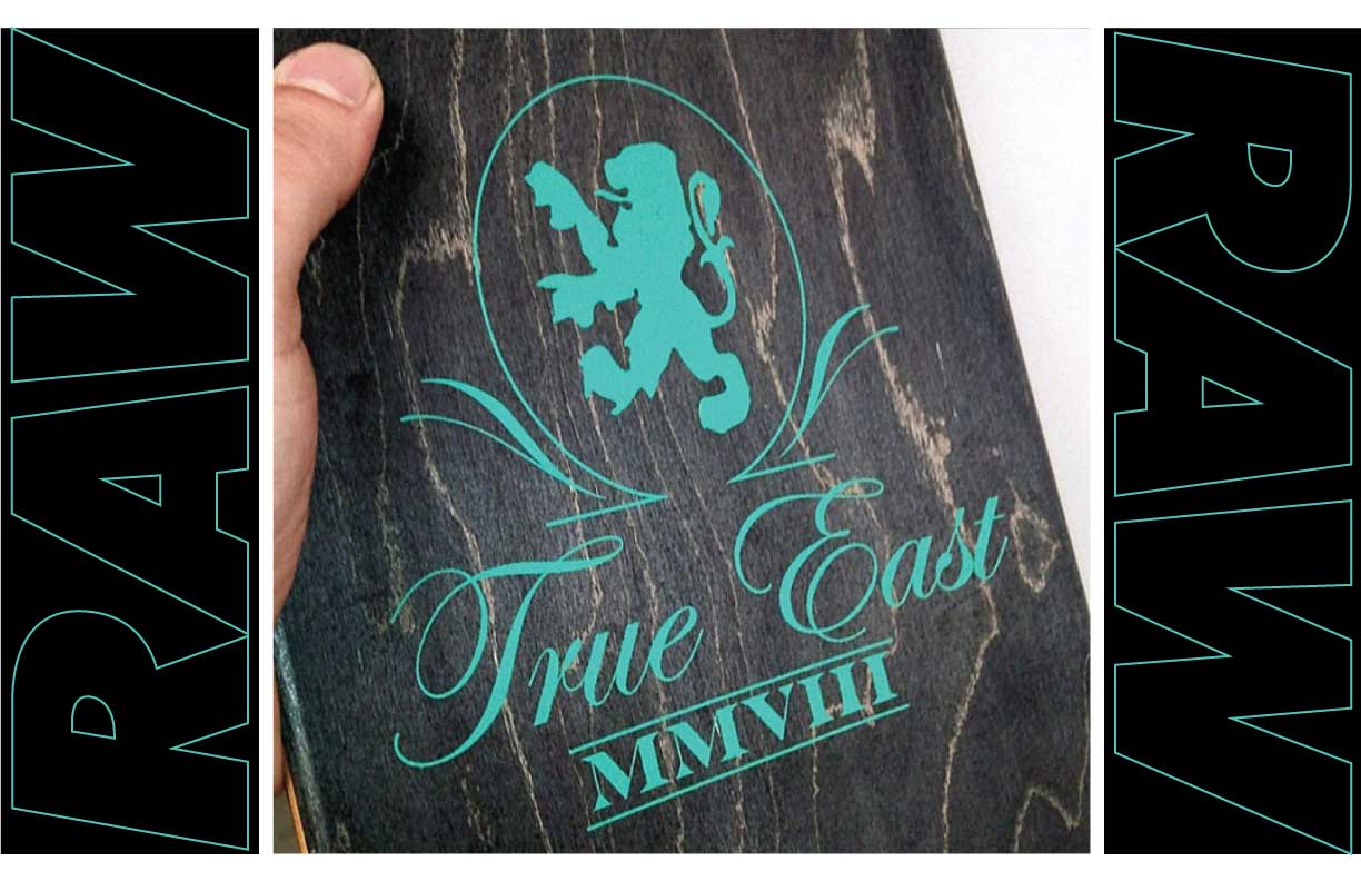
Then in 2008, the big moment arrived; I was working at the shop behind the counter at that point, and Steve Costello, one of the co-owners of RAW, came in with a proposal to do an exclusive colorway of their classic logo board specially for True East. Evan chose the black-and-teal color scheme (shown on mouseover in the image below), and I got to craft the graphic for the topsheet. It wasn’t much, but it was a start.
I couldn’t wait to get more board graphics going, and I was always pitching ideas to Steve and his business partner Kevin Susienka.
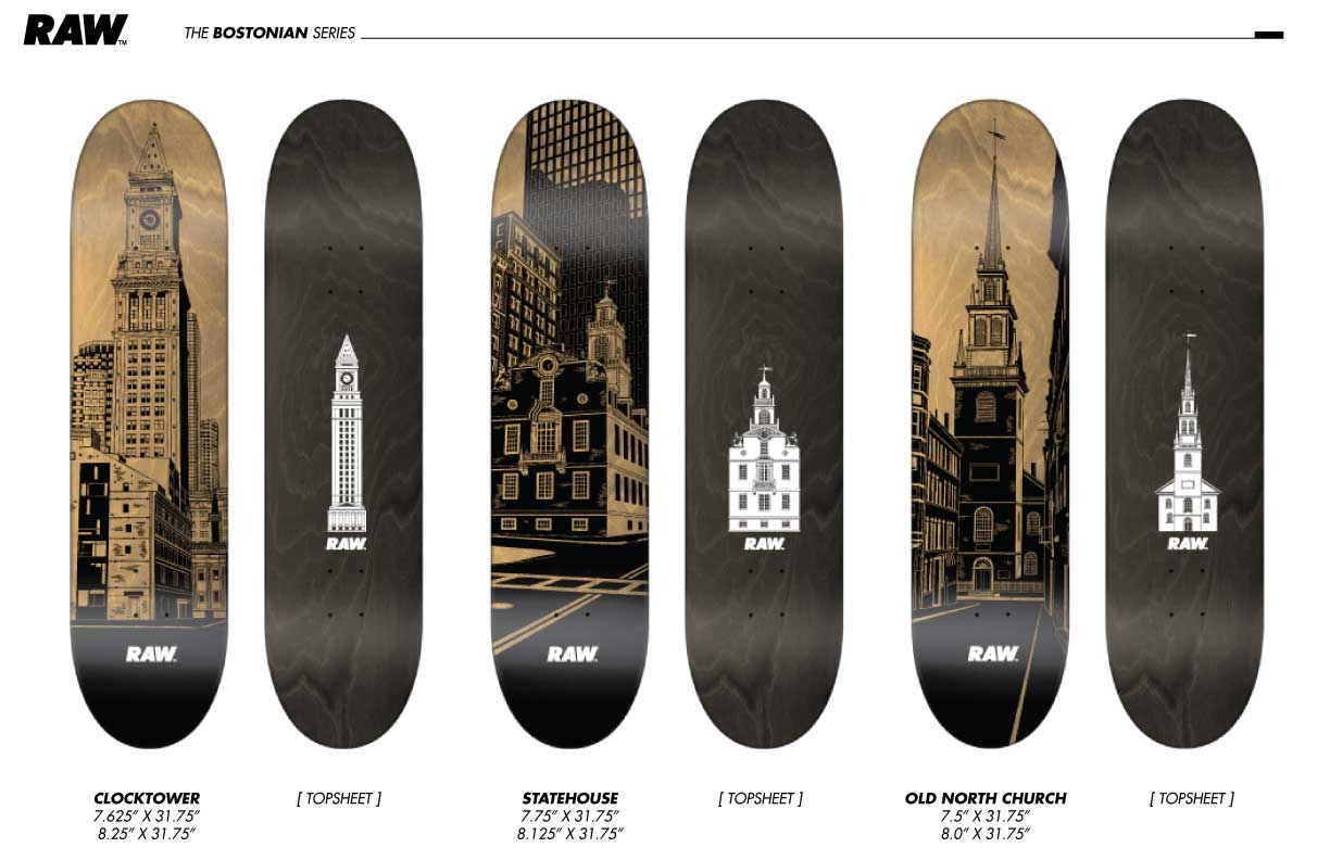
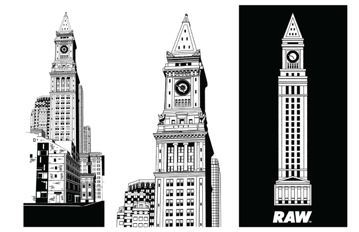
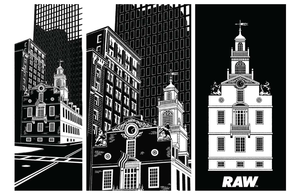
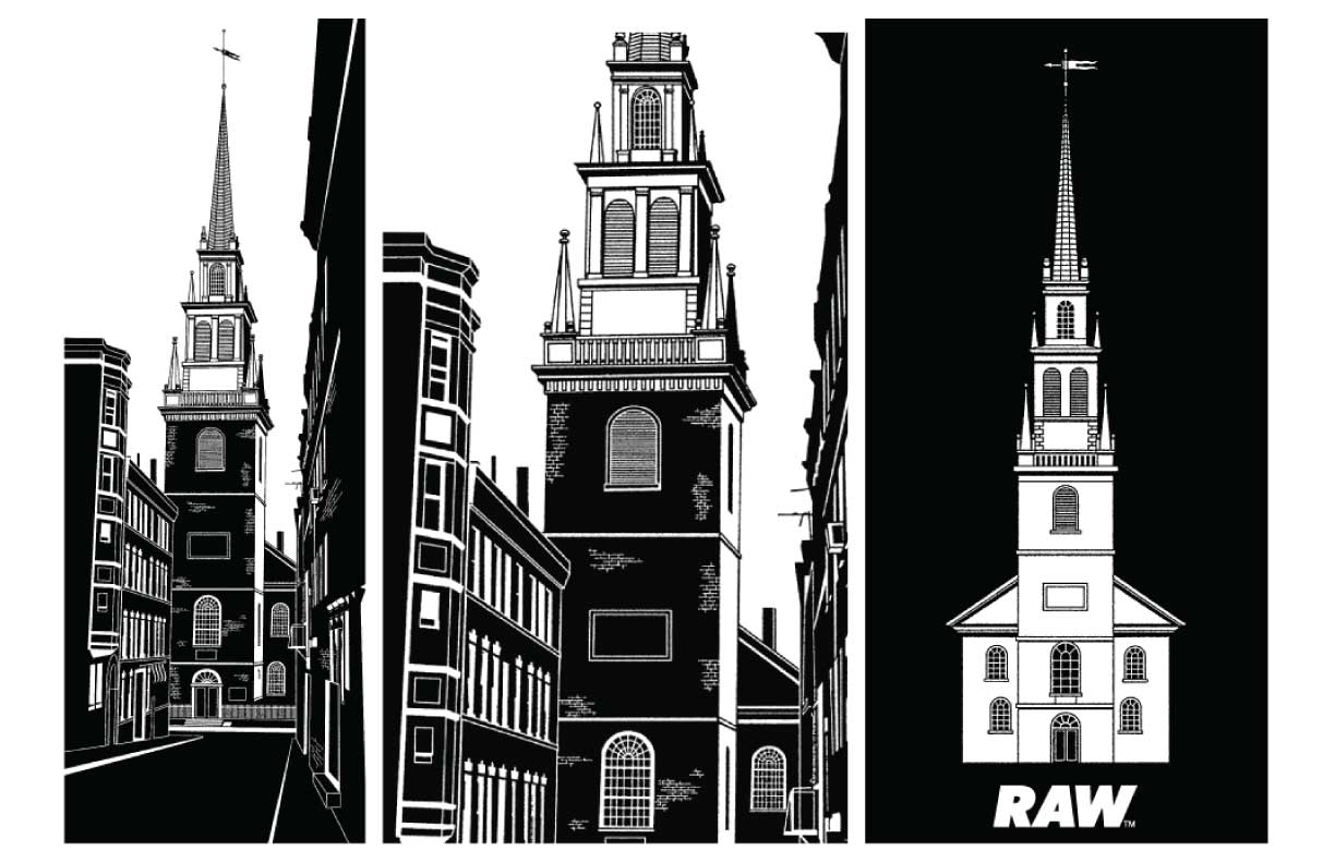
In 2010 I did my first series for RAW, the Bostonian boards, which featured illustrations of iconic Boston landmarks: the Custom House (aka Clocktower, a favorite skate spot); the Statehouse (site of the Boston Massacre); and Old North Church (‘two if by land, one if by sea’).
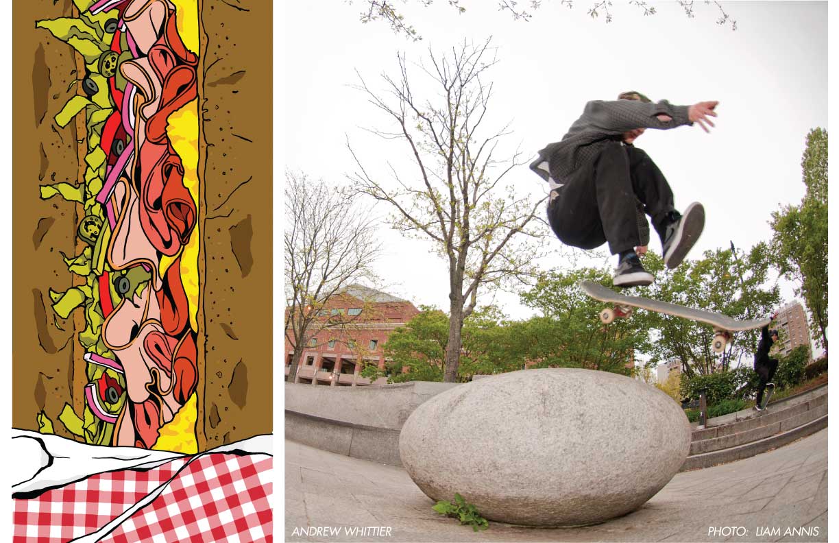
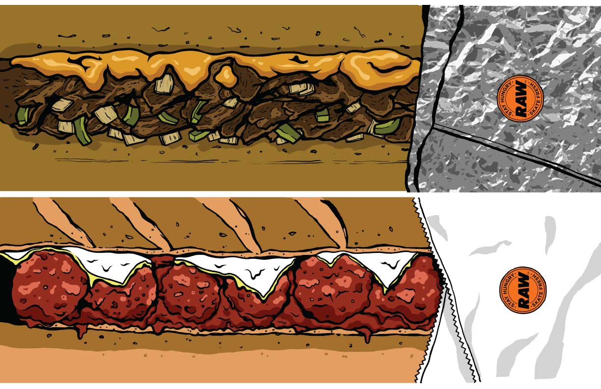
The next trio of RAW boards I designed was the Stay Hungry series, art directed by Kevin Susienka.
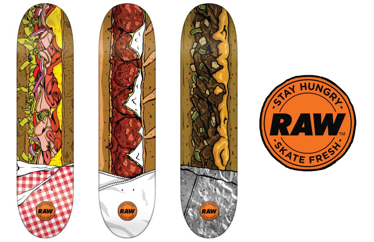
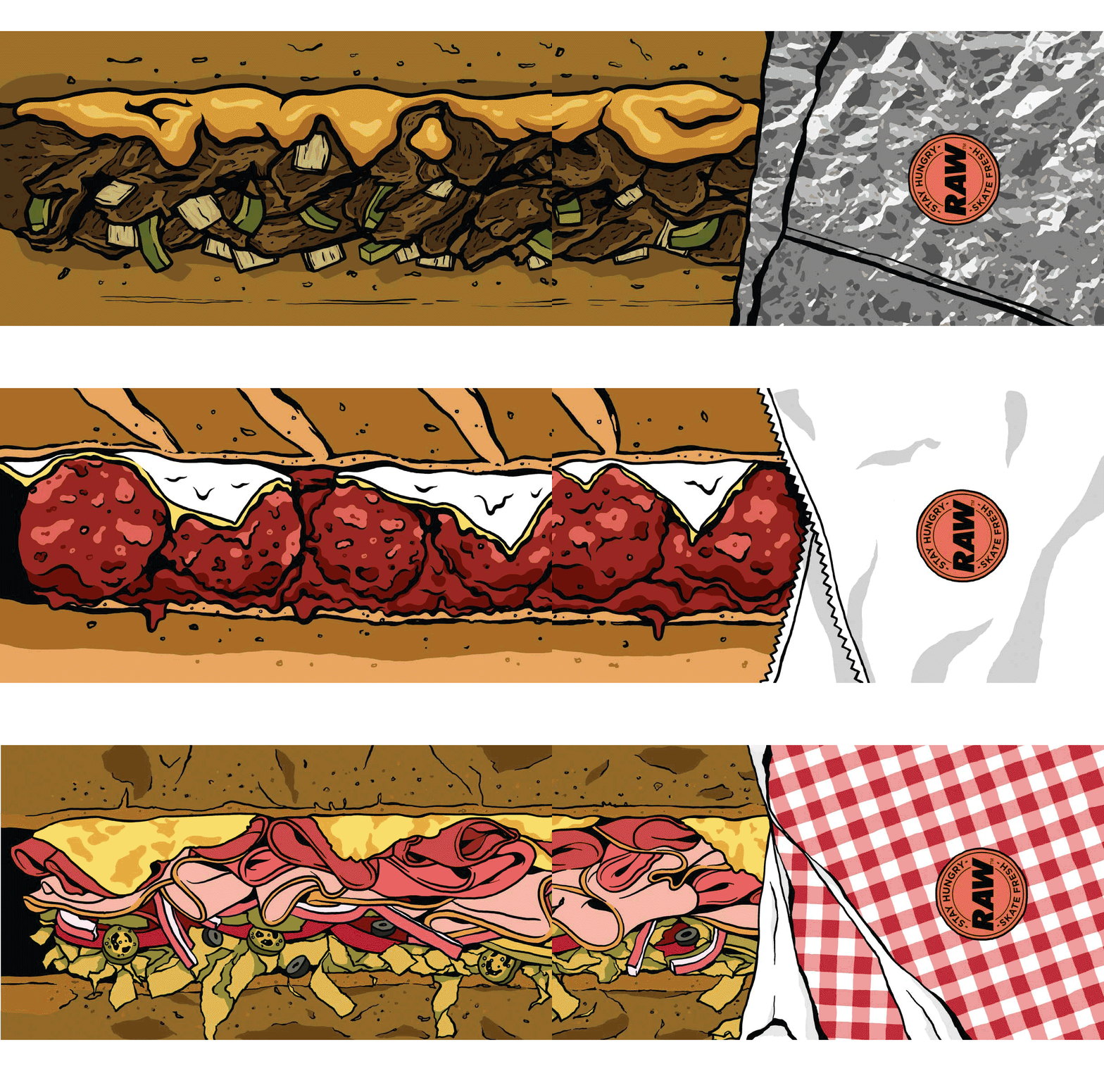
Not many know this, but hidden in the cheese of steak-and-cheese graphic are the letters ‘GMAC,’ a salute to our buddy Gavin Macmahon-Nolan, who at the time was a known steak-and-cheese fanatic. He later became vegetarian.
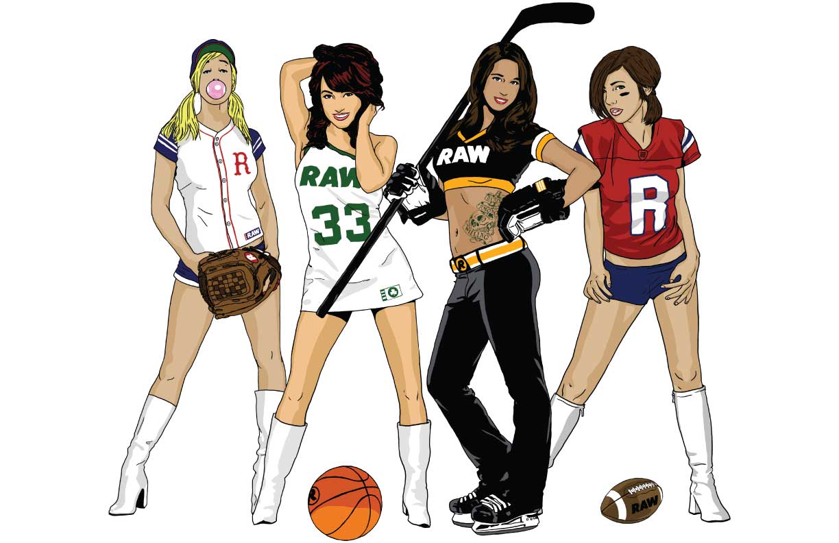
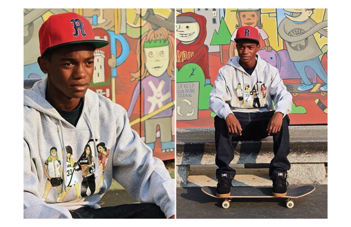
The next RAW boards I did were called the ‘Team Spirit’ series. They featured female fans of Boston’s big four sports teams.

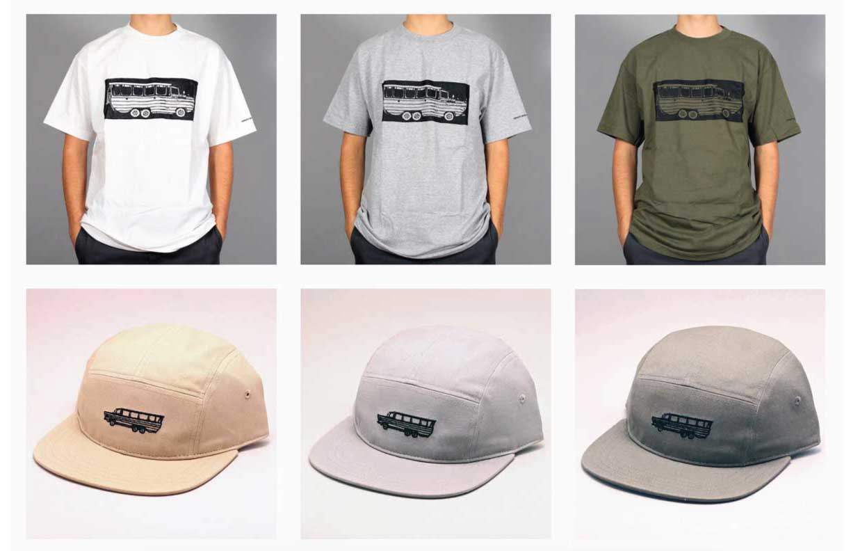
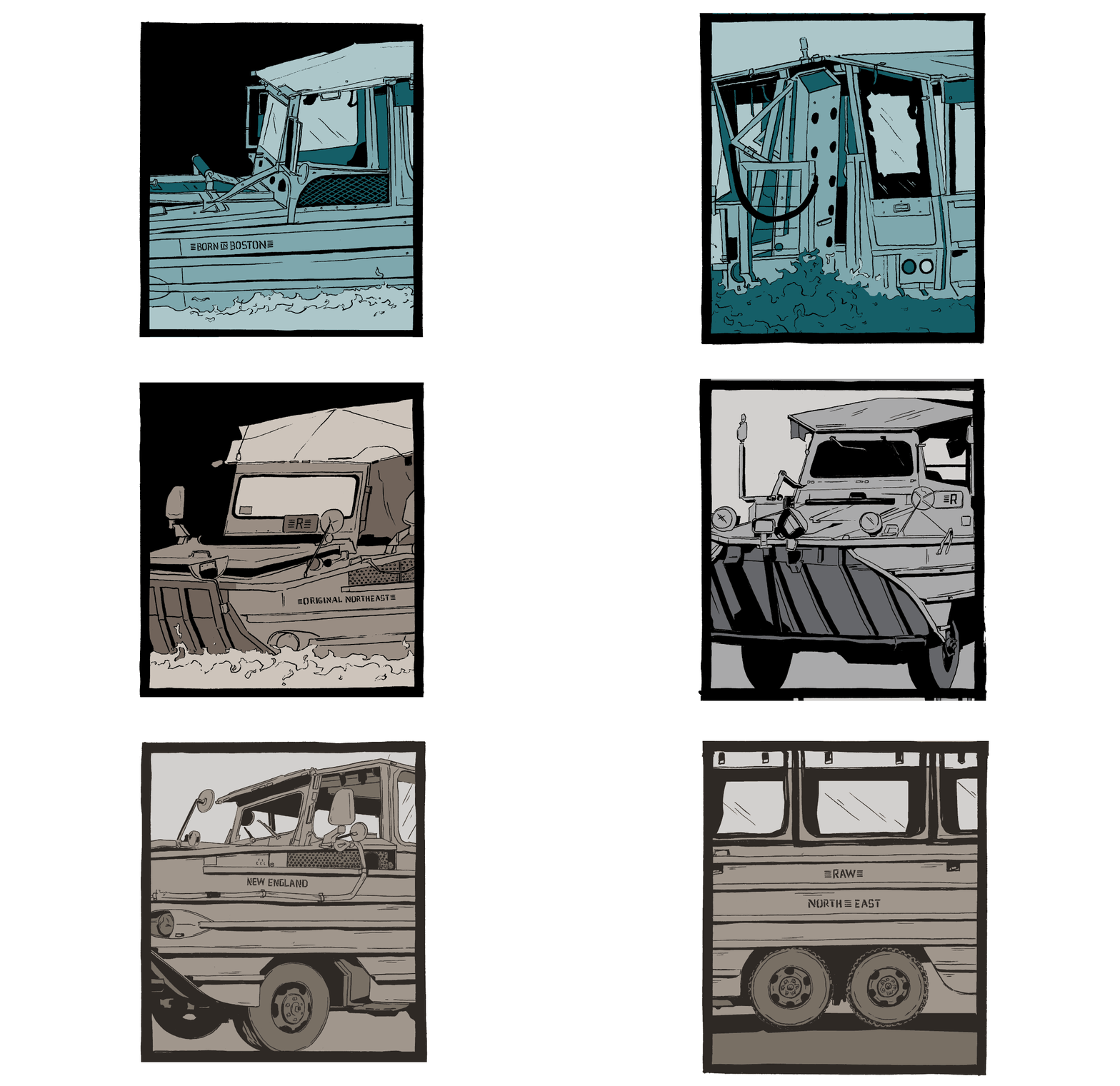
Here are what may be my favorite board graphics I’ve ever done! The ‘DUKW’ boards (named for the official U.S. military acronym for the famed amphibious Duck Boats) were harder to design than I imagined. Steve and Kevin wanted to do something with these Boston icons, and I wound up making paneled illustrations based on photos I shot of the Ducks all around town.
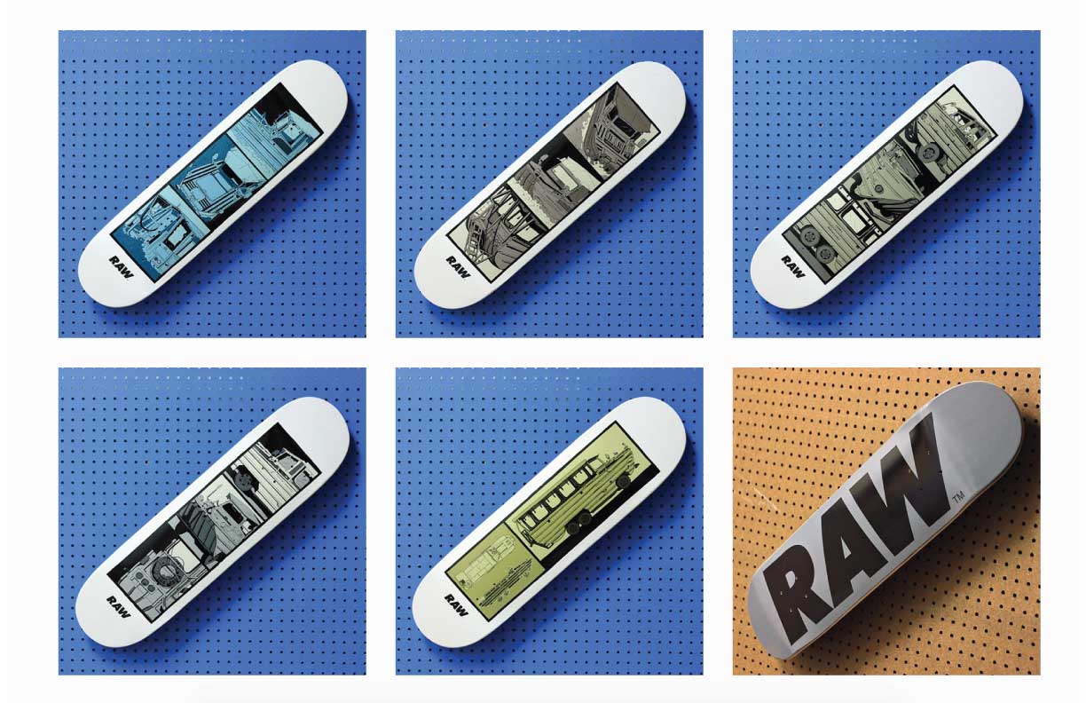
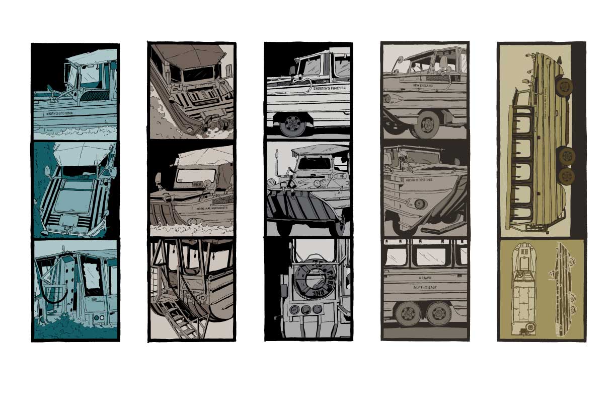
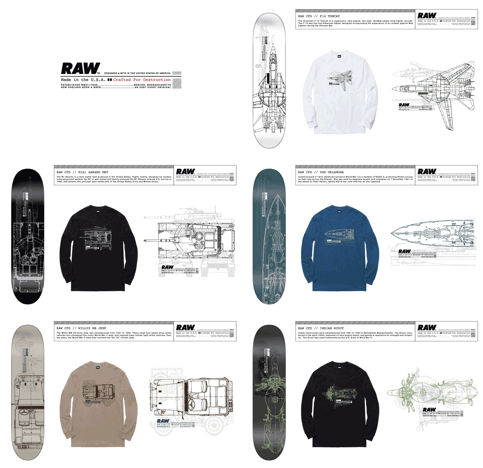
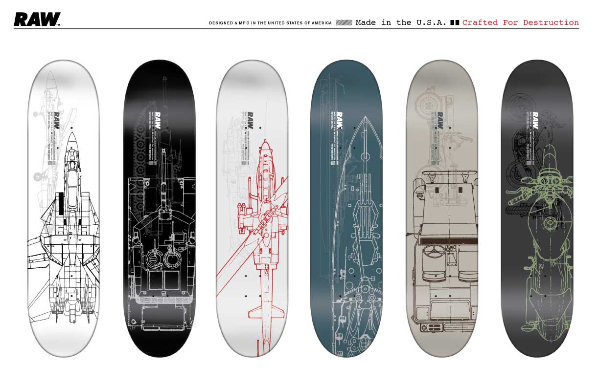
The ‘Crafted For Destruction’ series was inspired by the idea that skateboards themselves are built to be shredded and destroyed. Steve and Kevin came up with the broad concept, and I suggested that we do a military vehicle-based run of graphics.
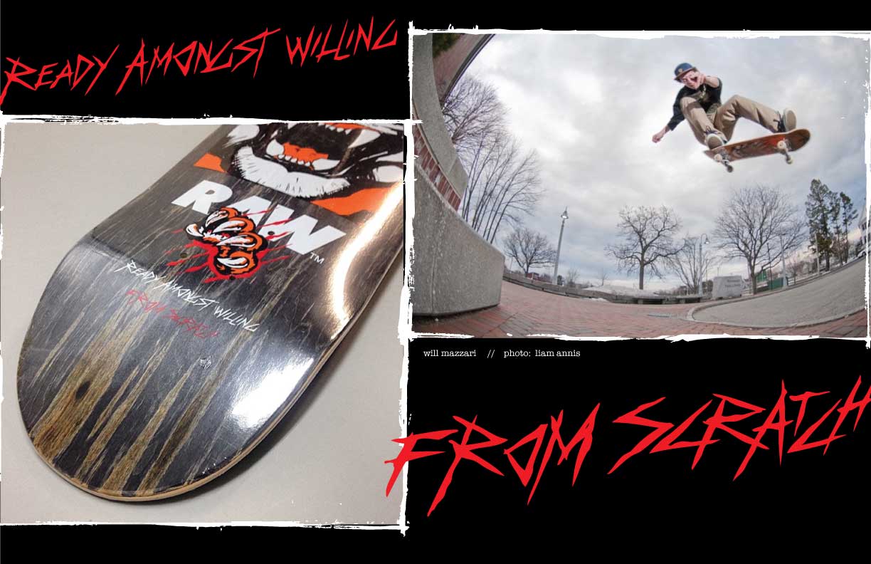
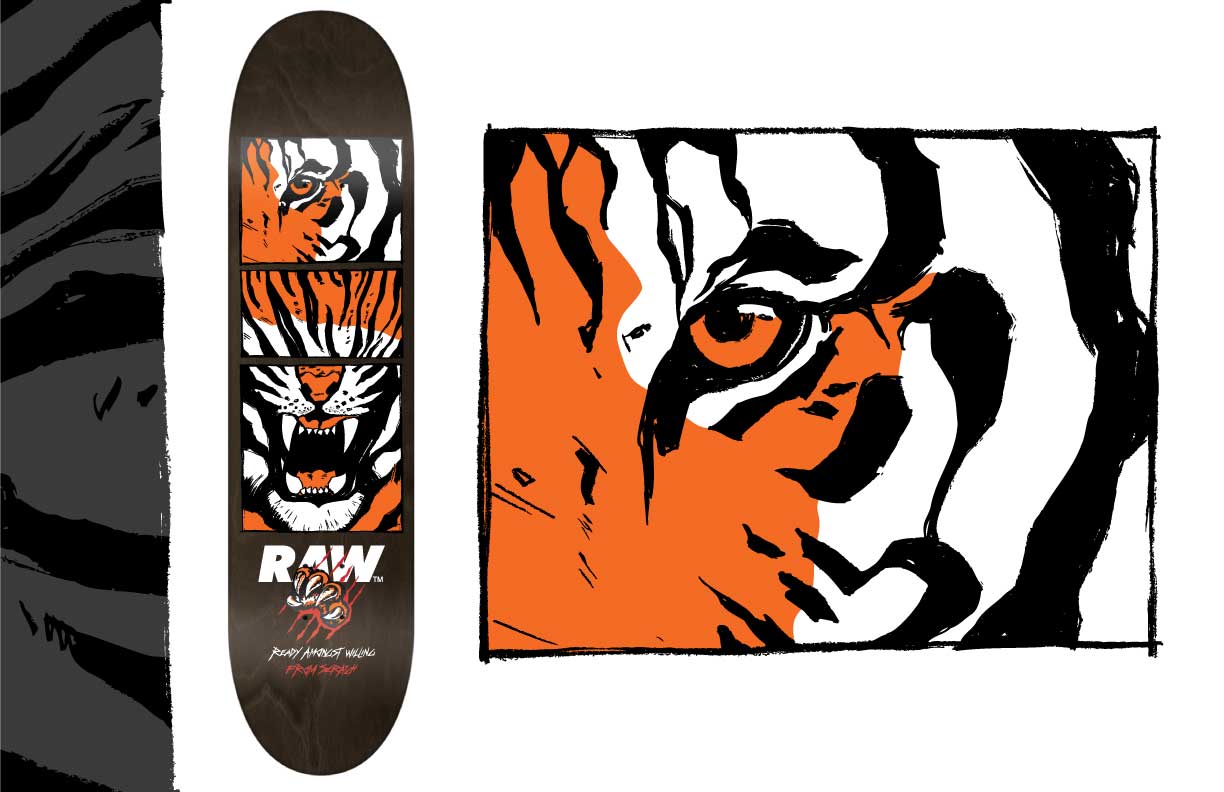
The ‘From Scratch’ board was originally meant to be a DGK collaboration. That fell through, and I think it turned out better as a RAW original.
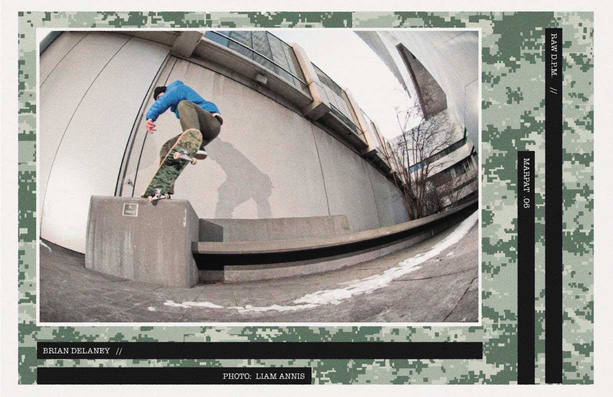
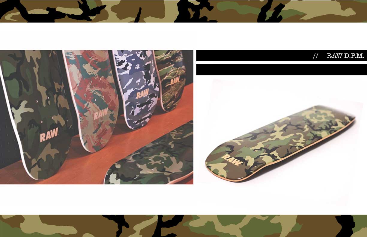
The ‘D.P.M.’ series (‘Disruptive Pattern Material’) was a group of camouflage-patterned boards. Some of these patterns were available in archival resources; others I drew myself. The Tiger Camo pattern was based on some fatigues I bought (and wore) from the Army/Navy Surplus Store in Boston’s Downtown Crossing.
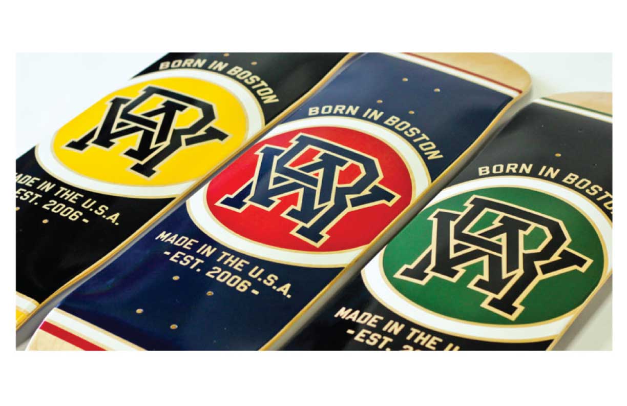
The ‘Varsity Cipher’ boards came out at a time when cyclical lockups were all the rage in the world of streetwear.
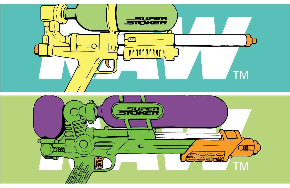
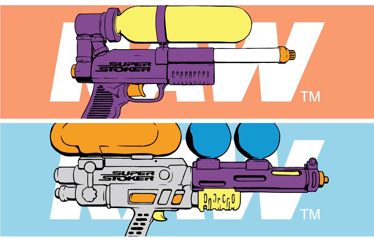
These ‘Super Stoker’ graphics never came out, but I think they would have made a great series. I devised the concept, and Steve came up with the Super Stoker name.